Command Palette
Search for a command to run...
CHARTGALAXY : UN JEU DE DONNÉES POUR LA COMPRÉHENSION ET LA GÉNÉRATION DE GRAPHIQUES INFOGRAPHIQUES
CHARTGALAXY : UN JEU DE DONNÉES POUR LA COMPRÉHENSION ET LA GÉNÉRATION DE GRAPHIQUES INFOGRAPHIQUES
Résumé
Les graphiques infographiques constituent un moyen puissant de communiquer des données abstraites en combinant des éléments visuels (par exemple, des graphiques, des images) avec des informations textuelles. Cependant, leur richesse visuelle et structurelle pose des défis aux grands modèles vision-langage (LVLM), généralement entraînés sur des graphiques simples. Pour combler cette lacune, nous présentons ChartGalaxy, un jeu de données à l'échelle du million conçu pour faire progresser la compréhension et la génération de graphiques infographiques. Le jeu de données est construit selon un processus inductif qui identifie 75 types de graphiques, 440 variations de graphiques et 68 modèles de mise en page à partir de graphiques infographiques réels, puis les utilise pour créer des graphiques synthétiques de manière programmatique. Nous démontrons l'utilité de ce jeu de données à travers : 1) l'amélioration de la compréhension des graphiques infographiques par affinage, 2) l'évaluation comparative de la génération de code pour les graphiques infographiques, et 3) la génération de graphiques infographiques à partir d'exemples. En capturant la complexité visuelle et structurelle de la conception réelle, ChartGalaxy fournit une ressource utile pour améliorer le raisonnement multimodal et la génération dans les LVLM.
One-sentence Summary
Tsinghua University and Newcastle University introduce ChartGalaxy, a million-scale dataset for infographic chart understanding and generation that is constructed by inductively deriving 75 chart types, 440 chart variations, and 68 layout templates from real infographic designs and using them to programmatically synthesize charts, thereby enabling fine-tuned infographic chart understanding, benchmarking code generation, and example-based infographic chart generation.
Key Contributions
- ChartGalaxy is a million-scale dataset of paired infographic charts and tabular data, containing 61,833 real charts and 1,701,356 synthetic charts generated from real-world design patterns.
- A structured synthesis pipeline extracts 75 chart types, 440 chart variations, and 68 layout templates from real infographics and programmatically creates diverse synthetic infographic charts at scale.
- Three applications demonstrate the dataset's utility: fine-tuning for infographic chart understanding, benchmarking code generation for infographic charts, and enabling example-based infographic chart generation.
Introduction
Infographic charts are widely used in news, business, and education because they combine text and visual elements to make data more accessible. However, large vision-language models such as GPT-4, Gemini, and LLaVA still struggle to understand or generate these charts due to complex visual-text interactions, diverse layouts, and the need for cross-modal reasoning. Prior chart datasets mostly contain plain charts, and existing infographic-specific datasets are too small or lack sufficient design diversity, which limits model generalization. The authors address this gap by constructing ChartGalaxy, a million-scale dataset with 61,833 real and 1,701,356 synthetic infographic charts paired with source data tables. The dataset is built through a human-in-the-loop pipeline that extracts layout templates and chart variations from real designs, enabling applications in visual question answering, code generation, and example-based infographic chart generation.
Dataset
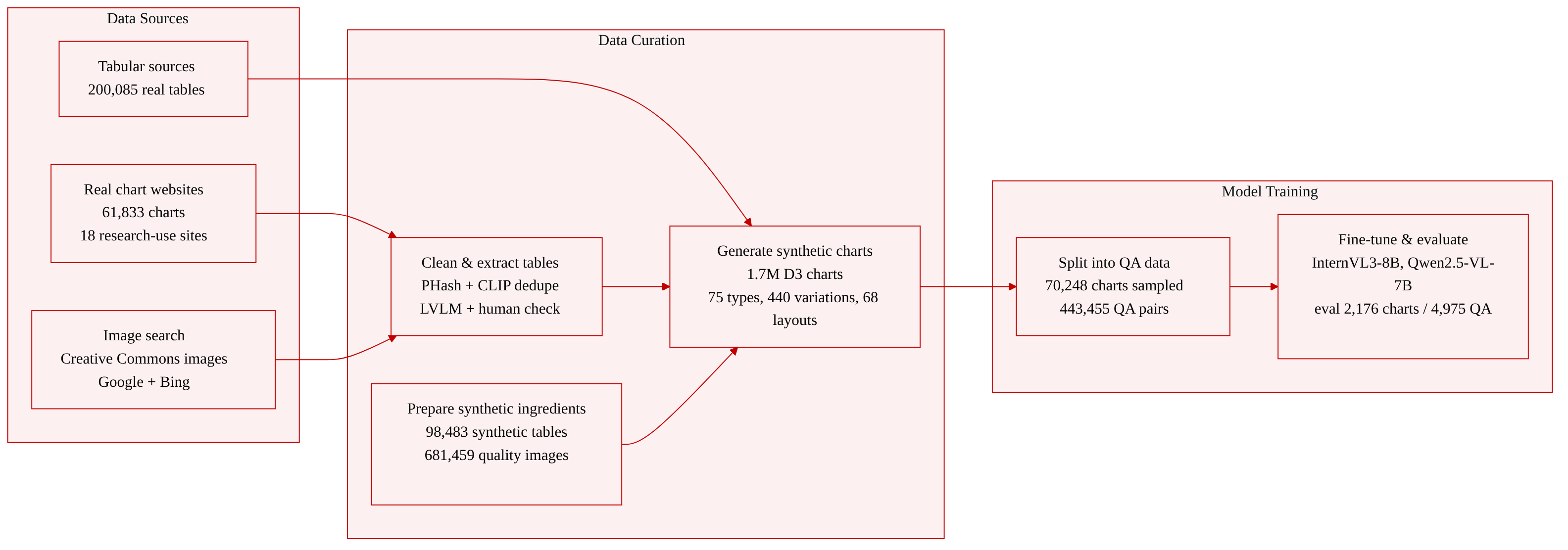
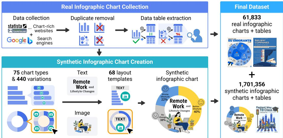
The authors construct ChartGalaxy in two stages: collecting real infographic charts, then using them to derive design patterns and programmatically create synthetic infographic charts.
Dataset composition and sources
- Real infographic charts: 61,833 charts collected from 18 chart-rich websites that permit research use, including Statista and Visual Capitalist.
- Additional real charts: Retrieved via Google Images and Bing Images using built-in license filters to keep only Creative Commons images.
- Deduplication: Duplicate images are removed with Perceptual Hashing and CLIP similarity.
- Tabular data for real charts: Extracted through a multi-step LVLM pipeline with human-in-the-loop verification.
Synthetic infographic chart creation
- The authors derive 75 chart types from Data Viz Project and Datylon taxonomies, and identify 440 chart variations with different visual styles.
- Charts are rendered with D3.js to support visual features unavailable in libraries like Matplotlib or Seaborn.
Layout templates
- Initial set: 55 layout templates manually annotated from 1,500 real charts sampled from Statista and Visual Capitalist.
- Expanded set: 68 total templates after using a detection model, PP-OCRv4 text extraction, LTSim layout similarity, k-means clustering, and manual inspection of cluster centroids.
Tabular and image repositories
- Real tabular data: 200,085 tables from VizNet, UN data, the World in Data, and Papers with Code.
- Synthetic tabular data: 98,483 tables generated with Gemini-2.0-Flash.
- Each table is supplemented with a topic and several data facts.
- Image repository: 681,459 images from Icon645 and Noun Project, filtered for low ink ratio, poor resolution, or extreme aspect ratios.
- Images include Gemini-generated descriptive keywords and captions, and are retrieved using Sentence-BERT similarity.
Synthetic chart generation details
- Titles and subtitles are generated via retrieval-augmented prompting, using Sentence-BERT to retrieve relevant real charts and Gemini-2.0-Flash to generate text.
- Chart type selection follows data-to-chart mapping rules, with Gemini used when multiple chart types are suitable.
- Chart variations are sampled adaptively to favor underrepresented variations.
- Color palettes are extracted from real infographic charts and supplemented with harmonic colors when needed.
- Layout optimization selects a compatible template with the highest ink ratio through constrained packing and grid search.
Final dataset statistics
- 1,701,356 programmatically generated infographic charts.
- 61,833 real infographic charts.
- Each chart is associated with tabular data.
- Covers 75 chart types, 440 chart variations, and 68 layout templates.
- Most frequent chart types: horizontal bar charts 11.7%, vertical bar charts 4.9%, scatterplots 3.5%.
How the dataset is used
- The authors sample 70,248 charts from ChartGalaxy to build an instruction dataset of 443,455 question-answer pairs, with balanced chart-type coverage for fine-tuning.
- Question types include:
- Text-based reasoning: data identification, data comparison, conditional data extraction, and fact checking.
- Visual-element reasoning: associating icons and visual elements with data values.
- Visual understanding: style detection, visual encoding analysis, and chart classification.
- A separate human-verified evaluation set contains 2,176 synthetic charts and 4,975 question-answer pairs. Synthetic charts are used here because they provide bounding-box annotations needed for visual-element questions.
- The paper fine-tunes InternVL3-8B and Qwen2.5-VL-7B on this instruction data and evaluates on InfographicVQA, ChartQAPro, and the independent infographic chart evaluation set.
Method
The authors propose a comprehensive two-stage method for constructing a large-scale infographic chart dataset, encompassing real infographic chart collection and synthetic infographic chart creation.
In the first stage, real infographic charts are aggregated from 18 chart-rich websites and search engines like Google and Bing, strictly filtering for Creative Commons licenses. To ensure data quality, the authors apply Perceptual Hashing and CLIP similarity to remove duplicates. They then employ a multi-step, human-in-the-loop verification pipeline utilizing Large Vision-Language Models (LVLMs) to extract accurate per-chart tabular data, yielding 61,833 high-quality real infographic charts paired with their source tables.
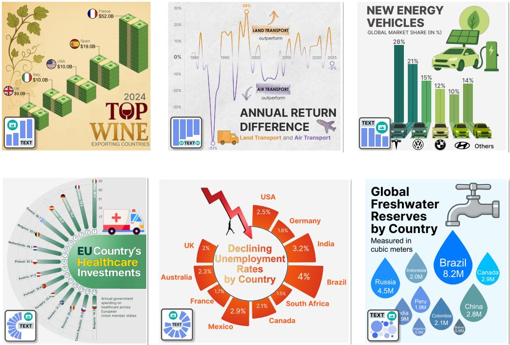
The second stage involves an inductive structuring process to programmatically generate synthetic charts. The authors first identify 75 chart types and 440 distinct visual variations, implementing them using D3.js to support complex visual features. A critical component of this stage is layout template extraction, which defines the spatial relationships among text, images, and charts. This process begins with manual annotation of 1,500 real charts to initialize 55 layout templates. To expand coverage, the authors fine-tune an InternImage model with a DINO detector on preliminary synthetic charts to detect element regions, using PP-OCRv4 for text extraction. By measuring layout similarity with LTSim and applying k-means clustering, they identify 13 additional templates, resulting in a total of 68 layout templates.
The template-based infographic chart creation pipeline proceeds in three steps: tabular data curation, element generation, and layout optimization. The authors curate a rich repository of real and synthetic data tables, augmenting each with topics and data facts. For element generation, they utilize a retrieval-augmented prompting strategy with Sentence-BERT and Gemini-2.0-Flash to generate titles and subtitles. Images are retrieved from a curated repository of over 680,000 icons based on semantic similarity to the chart title. Chart types are selected via predefined data-to-chart mapping rules and refined by Gemini-2.0-Flash, with variations chosen through adaptive sampling to maintain distributional balance.
Finally, layout optimization is performed to maximize visual appeal and data clarity. The authors formulate this as a constrained packing problem, aiming to select the template with the highest ink ratio while preserving a minimum distance between elements. The optimization objective is defined as:
Emax∣∪iei∣/∣f(∪iei)∣,s.t.d(∂ei,∂ej)≥p,∀i=j.Here, ei represents the pixel set of an element, f(e) denotes the pixel set within the tight-fitting bounding box of e, and E is the set of elements. The constraint ensures that the minimum pairwise distance d between element contours ∂ei and ∂ej exceeds a threshold p. This problem is solved via grid search to finalize the chart layout.
Experiment
The experiments evaluate ChartGalaxy across instruction tuning for infographic chart understanding, code generation benchmarking, and example-based chart creation. Fine-tuning on the constructed question-answer dataset improves InternVL3-8B and Qwen2.5-VL-7B on public benchmarks and an independent evaluation set, with the largest gains in visual understanding questions. The code generation benchmark assesses rendered D3.js outputs for visual similarity, finding Gemini-2.5-Pro strongest among proprietary models while open-source models still lag. A user study further shows that the example-based layout and style adaptation method significantly outperforms GPT-Image-1 in fidelity, aesthetics, and creativity.
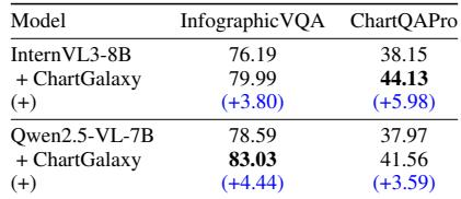
Fine-tuning with ChartGalaxy-derived instruction data improves public benchmark performance for both evaluated open-source LVLMs. Gains are consistent across InfographicVQA and ChartQAPro, though the size of improvement varies by model and benchmark. The largest relative gains appear on ChartQAPro for InternVL3-8B and on InfographicVQA for Qwen2.5-VL-7B. Adding ChartGalaxy instruction data raises accuracy on every reported model-benchmark pairing. InternVL3-8B improves more on ChartQAPro than on InfographicVQA, while Qwen2.5-VL-7B improves more on InfographicVQA than on ChartQAPro. ChartQAPro scores remain lower than InfographicVQA scores for both models after fine-tuning.
Fine-tuning with ChartGalaxy instruction data improves both InternVL3-8B and Qwen2.5-VL-7B across all evaluated categories on the independent infographic chart benchmark. Gains are especially large for visual-element-based reasoning and visual understanding, where baseline scores were relatively low. The two models converge to similar overall performance after fine-tuning. Improvements are largest for visual-element-based reasoning and visual understanding, with shape detection and visual element association showing the strongest gains. Text-based reasoning also improves consistently for both models, and overall performance reaches a comparable level after training.

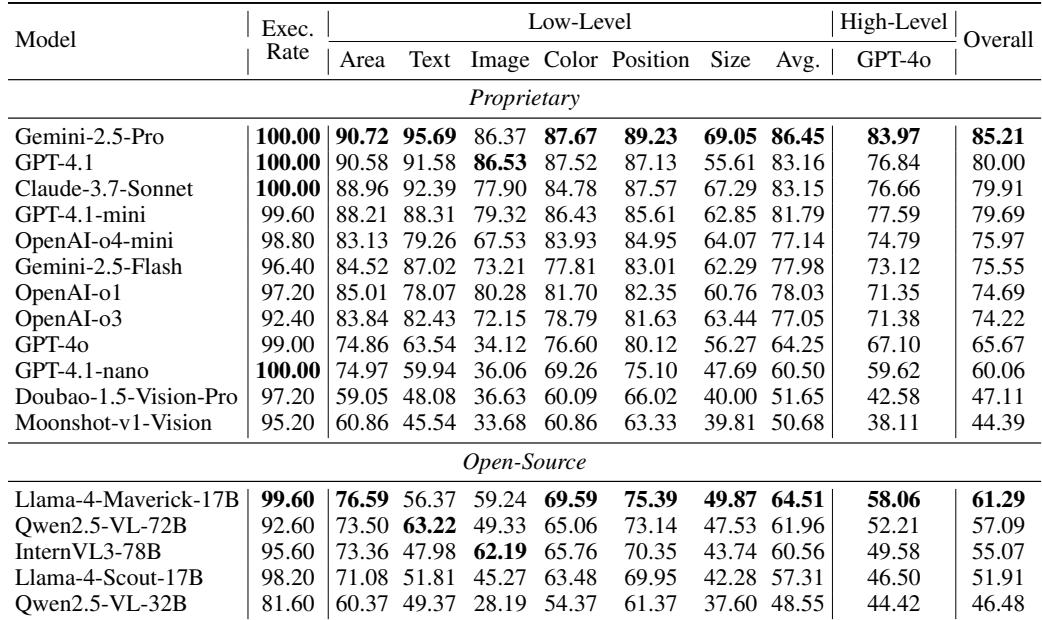
The benchmark evaluates LVLM-generated infographic chart code by rendering outputs and comparing low-level SVG element similarity and high-level visual similarity. Several reported top models achieve perfect execution rates, with Gemini-2.5-Pro showing the strongest overall and high-level results. Size similarity is consistently the weakest low-level metric across these models, indicating difficulty in matching element dimensions. Gemini-2.5-Pro achieves the highest overall score and high-level visual similarity among the reported models. The leading models reach perfect execution rates, while OpenAI-o4-mini trails on execution and most similarity metrics. Size similarity is the lowest low-level submetric for every listed model, often far behind text and position scores.
In an expert evaluation of example-based infographic chart generation, the proposed method outperformed GPT-Image-1 across fidelity, aesthetics, and creativity. The largest advantage was in data fidelity, where the proposed method preserved data accuracy while GPT-Image-1 showed serious labeling and proportion errors. Aesthetics and creativity scores were also higher for the proposed approach, reflecting its use of layout templates and varied chart types. The proposed method achieved significantly higher mean ratings than GPT-Image-1 on all three evaluated metrics. Fidelity showed the largest gap, with expert ratings favoring the proposed method by a wide margin over GPT-Image-1. GPT-Image-1 outputs were described as visually simpler and more monotonous, with limited chart-type variation. The proposed method benefited from extracted layout templates and support for a wider variety of chart types.

Fine-tuning with ChartGalaxy-derived instruction data consistently improves public benchmark accuracy for both InternVL3-8B and Qwen2.5-VL-7B, with the largest gains in visual-element-based reasoning and visual understanding. For infographic chart code generation, several leading models achieve perfect execution rates, and Gemini-2.5-Pro records the strongest overall and high-level visual similarity while size similarity remains the weakest metric. In expert evaluations, the proposed method outperforms GPT-Image-1 in fidelity, aesthetics, and creativity, with the largest advantage in data fidelity due to more accurate labeling and varied layout templates.