Command Palette
Search for a command to run...
Single-cell Transcriptome Sequencing Single Sample Tutorial: Quality Control, Clustering, (differential) Gene Display
Date
Size
2.42 GB
Paper URL
Tutorial on Single Cell Transcriptome Sequencing Analysis
The sample data used in this study comes from a paper published in Nature Medicine in July 2024. Personalized neoantigen vaccine and pembrolizumab in advanced hepatocellular carcinoma: a phase 1/2 trial Single-cell sequencing data of peripheral blood mononuclear cells from patient 6 (Yarchoan M et al. Nat Med. 2024;30:1044–1053.).
Introduction to Single-Cell Sequencing
Single-cell sequencing is a sophisticated biotechnology that allows scientists to deeply analyze gene expression at the level of individual cells. The process usually starts with a tissue sample, which is first dissociated into single cells to form a single-cell suspension. Then, using oil-in-water technology, each cell is individually encapsulated to ensure that they remain independent in subsequent analysis.
In single-cell sequencing, each cell's mRNA molecule is labeled with a unique molecular identifier, a process called UMI (Unique Molecular Identifier) labeling. At the same time, each cell is also given the same barcode label, which is used to track the source of each cell during the data analysis phase. In this way, researchers can accurately measure the mRNA information in each cell and understand the gene expression status of each cell.
1. Barcode function: record cell information
2. Application of UMI in single-cell sequencing: By providing a unique identifier for each mRNA molecule, it not only improves the accuracy of gene expression measurement, but also reduces the errors that may occur during PCR amplification, thereby enhancing the reliability and effectiveness of the entire sequencing process.
Basic process
The process of single-cell RNA sequencing (scRNA-seq) mainly includes single-cell isolation and capture, cell lysis, reverse transcription (converting RNA into cDNA), cDNA amplification and library preparation
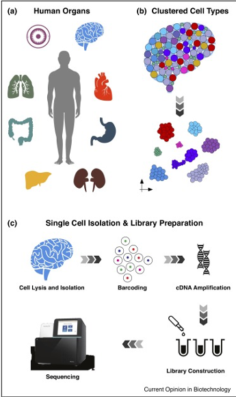
Image source: Kulkarni, A., et al. (2019). “Beyond bulk: a review of single cell transcriptomics methods and applications” Curr Opin Biotechnol 58: 129-136
Run steps
Now we will enter the practical part of the tutorial.
Start the container and upload data
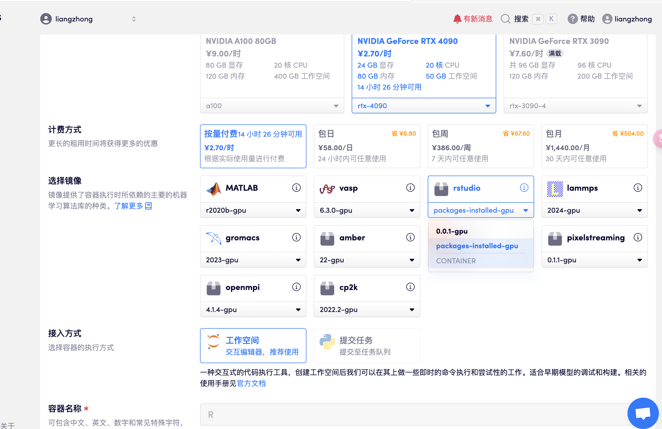
1. Start the container
Create a container, open rstudio, select the package-installed-gpu version, and directly open the API address to enter R studio after resources are allocated (this step requires real-name authentication), as shown in the following figure:
- Note: After entering the software, the account and password are: rstudio

2. Upload data
Upload the prepared data in advance (the data can be downloaded and used in the data folder of the working directory):
(1) Raw data of single cells sequenced by Illumina NextSeq 500: barcodes.tsv.gz, features.tsv.gz, matrix.mtx.gz
(2) Reference data for cell annotation: pbmc_multimodal.h5seurat, ref_Human_all.RData
#存放的目录如下
#此处可新建自定义文件夹,指定输入输出文件目录,本教程以 output 为例
rstudio@****(用户名)-bs5z6fbf81vrmain:~/home/output/data$ ls
barcodes.tsv.gz  features.tsv.gz  matrix.mtx.gz

rstudio@****(用户名)-bs5z6fbf81vr-main:~/home/output/reference_annotation$ ls
pbmc_multimodal.h5seurat  ref_Human_all.RData
Next, enter the code in R studio step by step according to the tutorial steps.
#报错改为英文
Sys.setenv(LANGUAGE = "en")
options(stringsAsFactors = FALSE)
#清空所有数据
rm(list=ls())
set.seed(100)#!!!设置随机数,保证后续实验的可重复性
1. Set up the Seurat object
# I. Setup -----------------------------------------------------------------------

# ## a. Load libraries ----------------------------------------------------------------------
```{r libraries}
library(Seurat)
library(SeuratObject)
library(sctransform)
library(patchwork)
library(Seurat)
library(SeuratData)
library(patchwork)
library(SeuratData)
library(ggplot2)
library(tidyverse)
library(glmGamPoi)
library(tools)
library(dplyr)
library(patchwork)
2. Loading Data
# II. Load data-----------------------------------------------------------------------
### a. Load data-----------------------------------------------------------------
getwd()#查看当前工作目录
setwd("~/home/output/results")
#修改工作目录,此处可根据自定义文件夹,指定输入输出文件目录,本教程以 output 为例
pbmc.data <- Read10X(data.dir ="~/home/output/data")#设置 10x 原始数据的工作目录,读取

seurat <- CreateSeuratObject(counts = pbmc.data, project = "pbmc", min.cells = 3, min.features = 200)#创建 seurat 对象
seurat
An object of class Seurat
16356 features across 10066 samples within 1 assay
Active assay: RNA (16356 features, 0 variable features)
 1 layer present: counts
#该样本有 10066 个细胞 ,10066 个单细胞的 RNA 表达数据,测序了 16356 个基因
#counts: 通常表示原始的基因表达计数数据
colnames([email protected])
[1] "orig.ident"      "nCount_RNA"      "nFeature_RNA"    "percent.mt"      "RNA_snn_res.0.1" "seurat_clusters"
[7] "celltype"
The pbmc.data data is shown in the figure below, with the number of reads, the row names are genes, and the column names are cell barcodes.
pbmc.data[c("CD3D", "CD8A", "PTPRC"), 1:30] 3 x 30 sparse Matrix of class "dgCMatrix" [[ suppressing 30 column names 'AAACCTGAGCGAAGGG-1', 'AAACCTGAGGCCCTTG-1', 'AAACCTGAGGGTTTCT-1' … ]]
CD3D 2 . 3 6 4 1 1 3 . 6 3 4 2 1 2 1 . 2 2 5 2 3 . 6 . 4 3 CD8A . 6 . . . 6 PTPRC 1 2 2 2 3 5 3 3 3 1 3 . 2 4 1 . 1 . 2 9 . 3 4 . 1 2 . 2 1 4
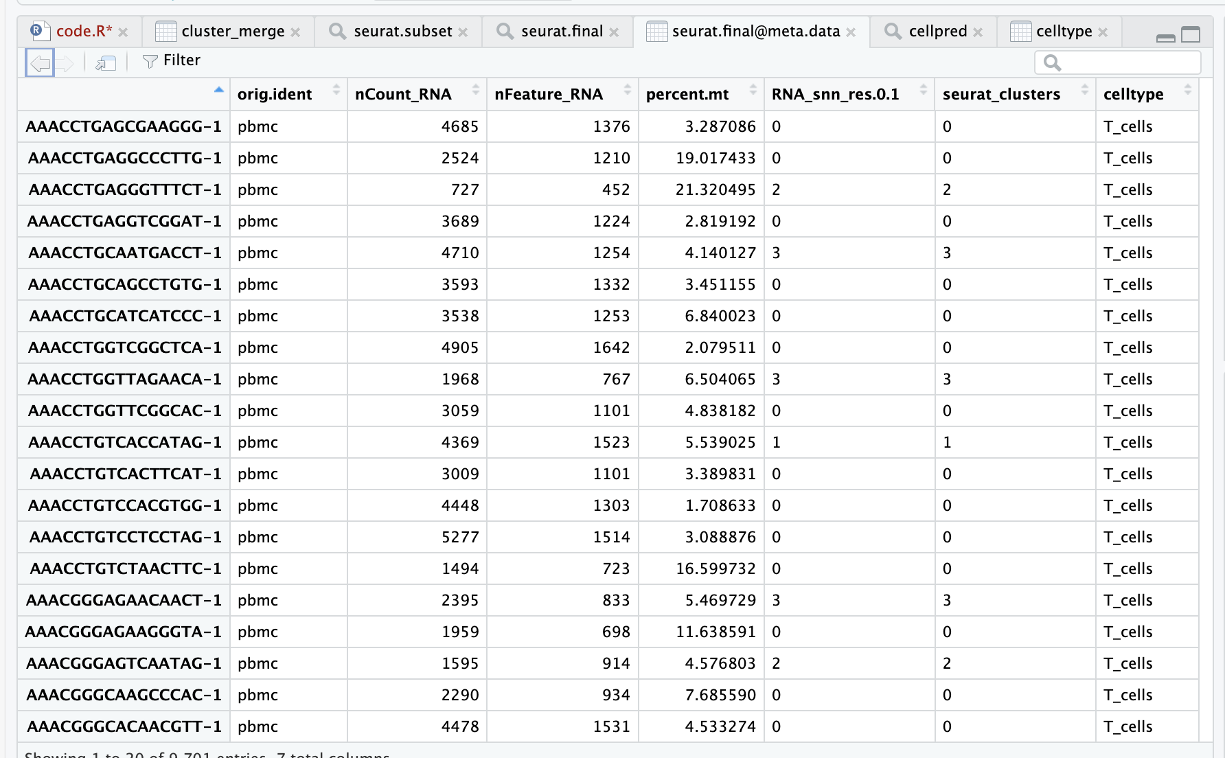
- Table information description:
- The row name is barcodes
- orig.ident is the sample information,
- nCount_RNA is the total gene expression
- nFeature_RNA is the number of genes
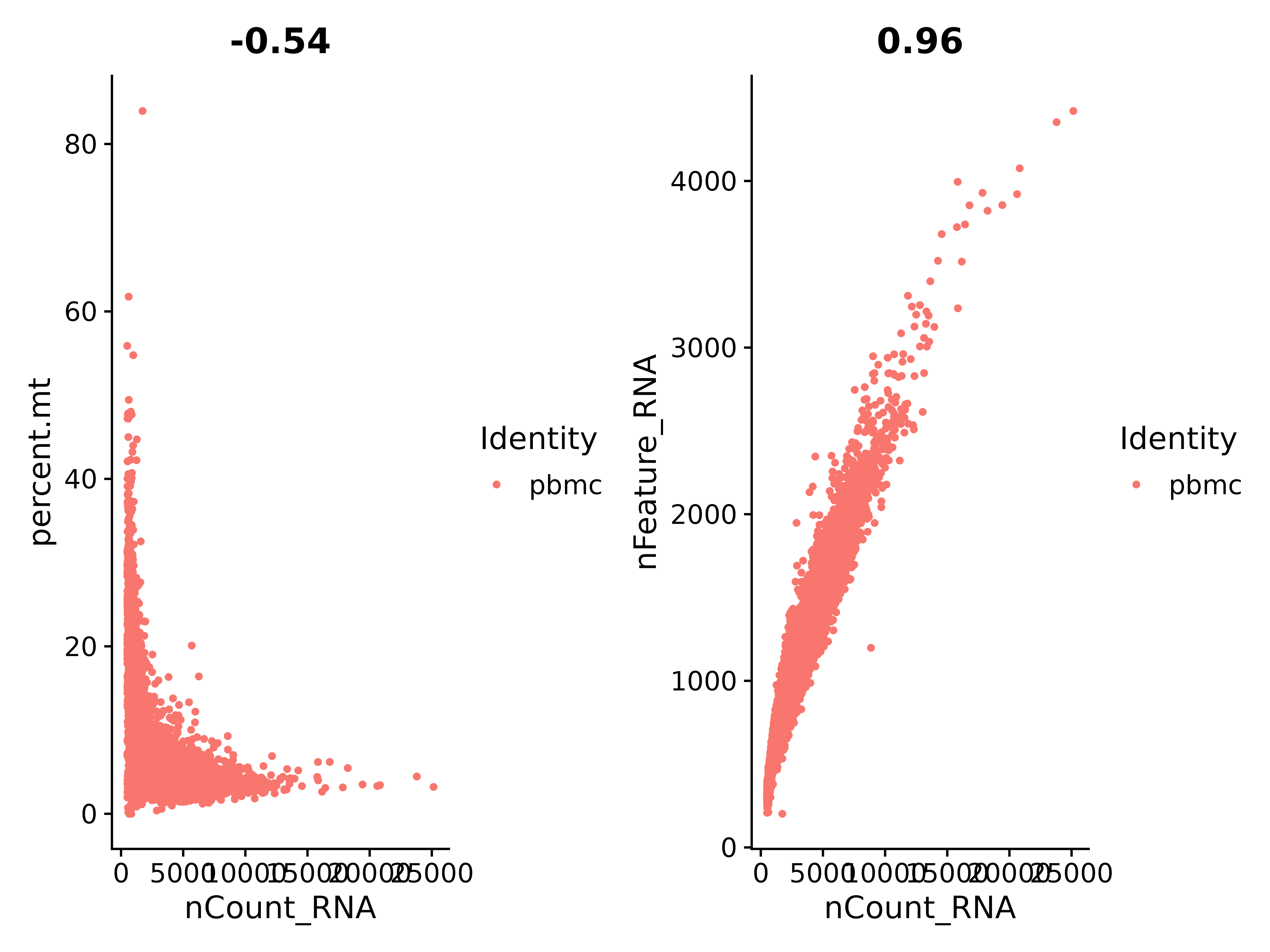
According to the above figure, let's check the ratio between nCount_RNA and percent.mt (mitochondrial gene):
It can be seen that nCount_RNA and nFeature_RNA are in positive proportion, with a coefficient of 0.96, and the correlation is very good.
Tips: All genes starting with MT- are mitochondrial genes.
3. Standard pretreatment
The following steps cover the standard preprocessing workflow for scRNA-seq data in Seurat. These steps include selecting and filtering cells based on QC metrics, data normalization and scaling, and detecting highly variable features.
Seurat can view QC metrics and filter cells based on any user-defined criteria.
# III. Pre-processing----------------------------------------------------------------
### a. Plots for percent mito, nFeature---------------------------------------------
```{r preprocessing}
# The [[ operator can add columns to object metadata. This is a great place to stash QC stats
seurat <-PercentageFeatureSet(seurat, pattern = "^MT-", col.name = "percent.mt")

# Use FeatureScatter is typically used to visualize feature-feature relationships, but can be used
# for anything calculated by the object, i.e. columns in object metadata, PC scores etc.
plot1 <- FeatureScatter(seurat, feature1 = "nCount_RNA", feature2 = "percent.mt",)
plot2 <- FeatureScatter(seurat, feature1 = "nCount_RNA", feature2 = "nFeature_RNA")
plot1 + plot2
ggsave("质控_1.png", plot1 + plot2, width = 8, height = 6, dpi=600)
#plot3 <- FeatureScatter(seurat, feature1 = "nCount_RNA", feature2 = "percent.ribo")
#plot3
Next, we visualize the QC metrics and use them to filter cells.
Look at the proportion of mitochondrial genes and use violin plots to visualize QC indicators
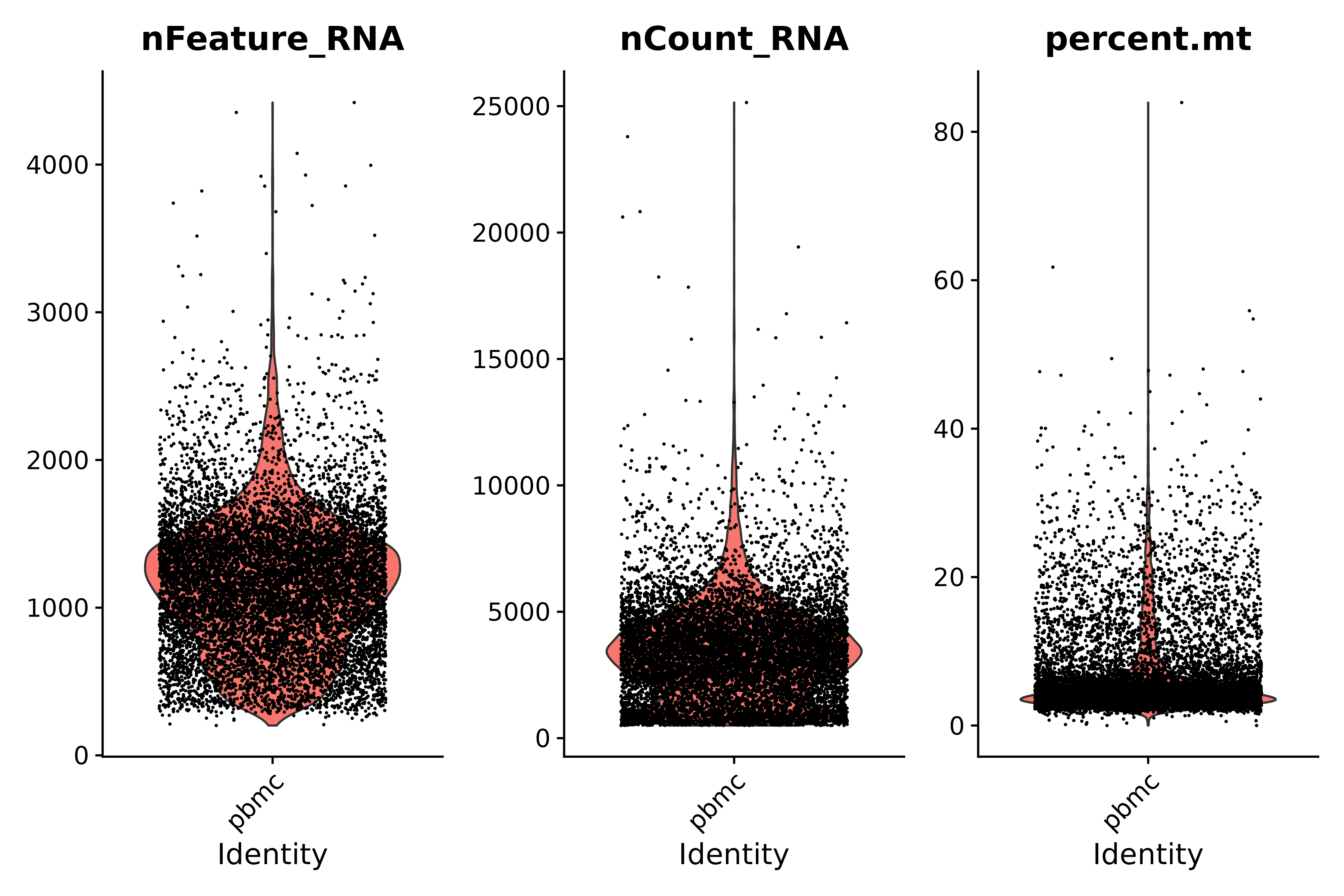
- Quality Control Instructions:
- Low-quality cells or empty droplets typically have very few genes, with nFeature_RNA > 200 and nCount_RNA > 500.
- Diploid or polyploid cells may exhibit abnormally high gene counts; according to our plot, nFeature_RNA < 2500 & nCount_RNA > 500
- Low-quality/dying cells usually show extensive mitochondrial hyperplasia, percent.mt < 25
# Visualize QC metrics as a violin plot
vln1 <- VlnPlot(seurat, features = c("nFeature_RNA", "nCount_RNA", "percent.mt"#,"percent.ribo"
                                     ),ncol=3)
vln1

ggsave("质控_2.png", vln1, width = 9, height = 6, dpi=600)
seurat.subset <- subset(seurat, subset = nFeature_RNA > 200 & nFeature_RNA < 2500 & nCount_RNA > 500 & nCount_RNA < 10000 &percent.mt < 25)
vln3 <- VlnPlot(seurat.subset, features = c("nFeature_RNA", "nCount_RNA", "percent.mt"), ncol = 3)
vln3
ggsave("质控_3.png", vln3, width = 9, height = 6, dpi=600)
pdf("qc_plots.pdf");plot1 + plot2;vln1;vln3;dev.off()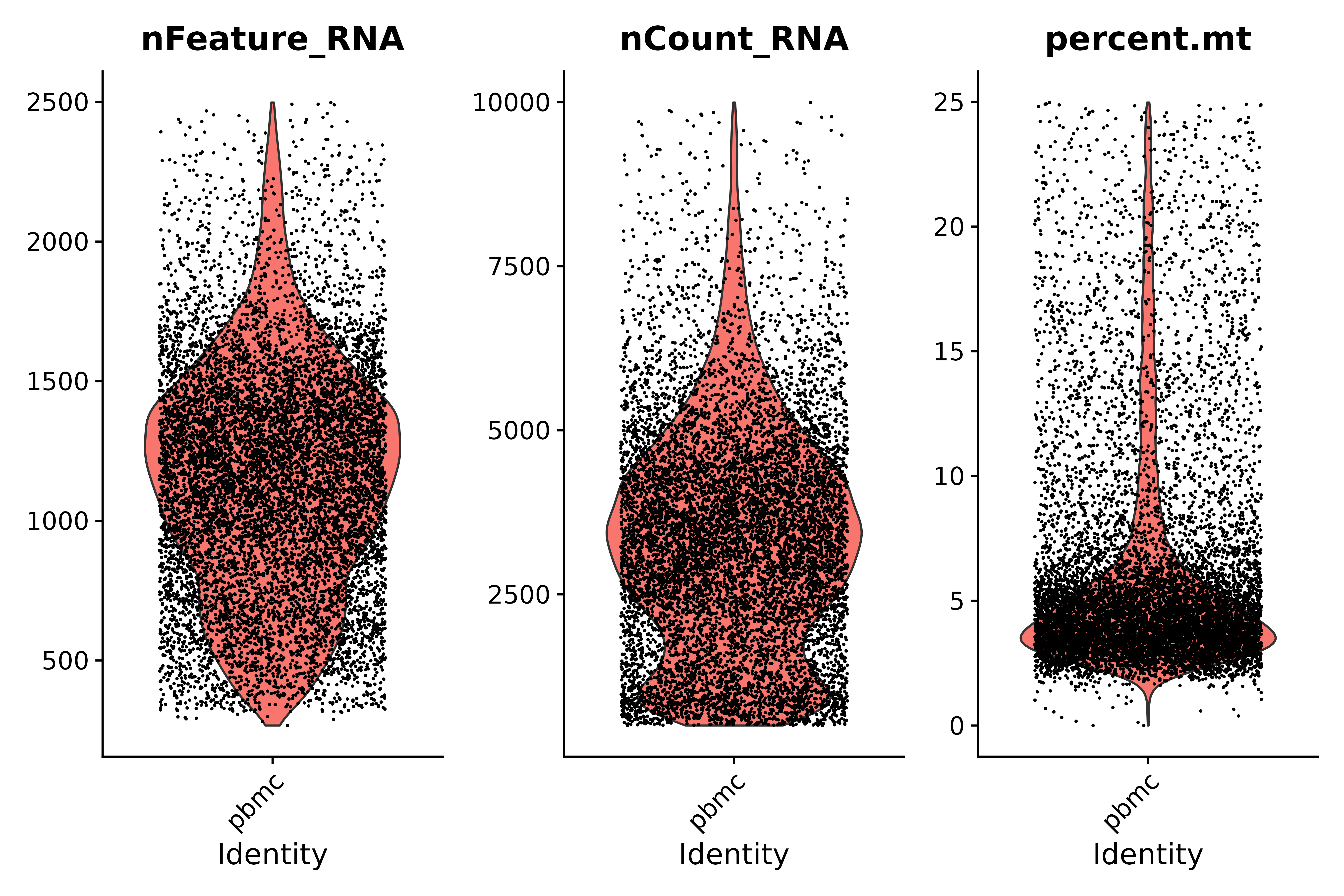
4. Normalize the data and identify highly variable features (feature selection)
In single-cell transcriptome data analysis, we first perform data normalization to ensure that gene expression levels between different cells can be effectively compared.
1. Data normalization
- Data normalization: We first divide the expression level (count) of a specific gene in each cell by the total expression level (total count) of the cell. This step is to eliminate the difference in sequencing depth between cells so that the gene expression levels of different cells can be compared on the same basis.
- Scaling adjustment: The normalized expression value is then multiplied by a scaling factor, here 10000, in order to adjust the gene expression value to a more appropriate magnitude for subsequent analysis.
- Logarithmic transformation: Finally, we performed a logarithmic transformation on the adjusted expression values, which helped to further stabilize the variance and make the differences between high- and low-expressed genes more obvious, laying the foundation for subsequent analysis steps.
- Normalization: Through the above steps, we normalized the gene expression values to the level of every 10,000 UMIs, which helps to eliminate the impact of differences in sequencing depth between cells.
2. Next, we search for mutation features:
After normalization and standardization, we analyzed the variability of gene expression to identify hypervariable genes. These genes have significantly different expression levels in different cells and may be highly expressed in some cells but expressed at lower levels in other cells.
# IV. Normalize Data----------------------------------------------------------------
seurat.subset <- NormalizeData(seurat.subset, normalization.method = "LogNormalize", scale.factor = 10000)
seurat.subset <- FindVariableFeatures(seurat.subset, selection.method = "vst", nfeatures = 2000)
# Identify the 10 most highly variable genes
top10 <- head(VariableFeatures(seurat.subset), 10)
# plot variable features with and without labels
plot3 <- VariableFeaturePlot(seurat.subset)
plot4 <- LabelPoints(plot = plot3, points = top10, repel = TRUE)

ggsave("VariableFeaturePlot_4.png", plot3 + plot4, width = 12, height = 6, dpi=600)
5. Scale Data and Run PCA
In single-cell transcriptome data analysis, data scaling and PCA can effectively reduce the dimension of the data, extract the main sources of inter-cell variation, and provide important information for understanding cell heterogeneity and function.
1. Scale Data: Data scaling is a linear transformation that aims to convert gene expression data into a standard normal distribution, that is, the mean of the data is 0 and the standard deviation is 1. This transformation helps to reduce the differences between different gene expression levels and make the data more normalized. By scaling, the impact of extreme values or outliers in the data can be reduced, making the data distribution more even, providing more stable input for subsequent analysis steps. This step is also a preparation for PCA (Principal Component Analysis), because PCA performs better on standardized data.
2. Run PCA:
- PCA is a statistical method that transforms data into a new coordinate system by transforming the orthogonal axes so that the first largest variance for any projection of the data is on the first coordinate (called the first principal component), the second largest variance is on the second coordinate, and so on.
- In single-cell transcriptome analysis, PCA is used to separate each cell based on differences in gene expression. Each cell can be considered as a point in a high-dimensional space, and PCA re-represents these points in a low-dimensional space while retaining as much variation information as possible.
- Each principal component (PCA) essentially represents a "meta-feature" of the cell, that is, a main variation direction of the cell. In the PCA results, the more front principal components, the greater their weight in the data variation, which means it contains more information.
- Through PCA, the high-dimensional expression information of cells can be compressed into several key principal components, which can be used for subsequent clustering analysis, visualization or other downstream analysis.
all.genes <- rownames(seurat.subset)
seurat.subset <- ScaleData(seurat.subset, features = all.genes)
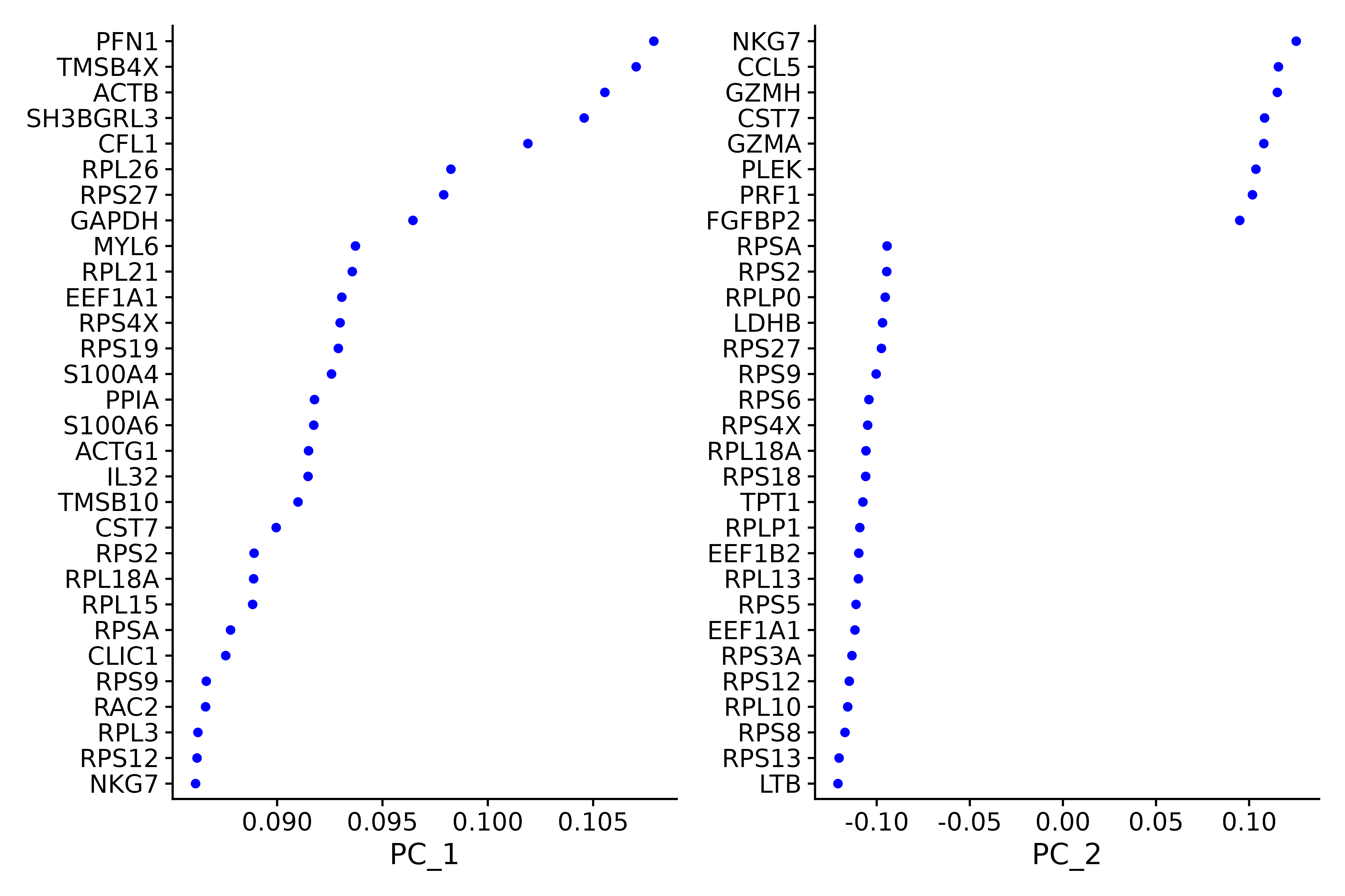
seurat.subset <- RunPCA(seurat.subset, features = VariableFeatures(object = seurat))##### Examine and visualize PCA results a few different ways-------------
print(seurat.subset[["pca"]], dims = 1:5, nfeatures = 5)
p1 <- VizDimLoadings(seurat.subset, dims = 1:2, reduction = "pca")
p1
ggsave("VizDimLoadings_5.png", p1, width = 9, height = 6, dpi=600)
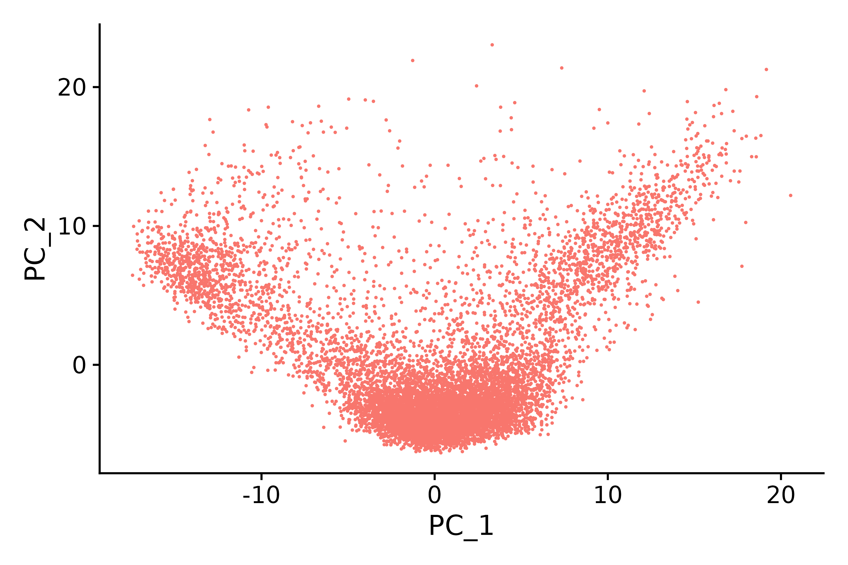
p2 <- DimPlot(seurat.subset, reduction = "pca") + NoLegend()
p2
ggsave("pca_6.png", p2, width = 6, height = 4, dpi=600)
p3 <- DimHeatmap(seurat.subset, dims = 1, cells = 500, balanced = TRUE)
p3
ggsave("pca_1dims.png", p3, width = 6, height = 4, dpi=600)
p4 <- DimHeatmap(seurat.subset, dims = 1:15, cells = 500, balanced = TRUE)
p4
ggsave("pca_15dims.png", p4, width = 10, height = 10, dpi=600)
p5 <- ElbowPlot(seurat.subset)
p5
ggsave("ElbowPlot.png", p5, width = 10, height = 10, dpi=600)
DimHeatmap() is a powerful data analysis tool that allows researchers to easily identify and explore major sources of heterogeneity in a dataset. After performing a principal component analysis (PCA), DimHeatmap() is particularly helpful in determining which principal components (PCs) should be included to inform subsequent in-depth analysis. This process involves sorting cells and features based on PCA scores, ensuring that the analysis is precise and relevant.
In addition, DimHeatmap() allows users to set a specific number of cells to draw only those "extreme" cells that show extreme characteristics at both ends of the data spectrum. This method significantly improves the efficiency of drawing when dealing with large data sets because it focuses on the most significant parts of the data, thereby speeding up the entire visualization process.
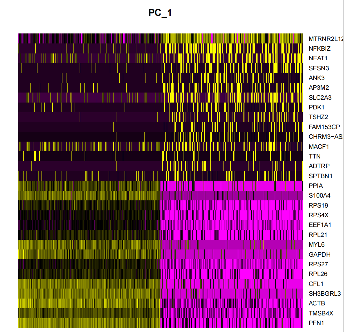

It is a common practice in principal component analysis (PCA) to use an "elbow plot" to determine how many principal components to retain for subsequent analysis. The figure shows that most of the real signal is captured in the first 17 principal components. In the elbow plot, we look for a turning point, the "elbow point". Before this point, each additional principal component will significantly improve the explanatory power of the data, but after this point, the gain from adding principal components begins to diminish.This indicates that a state of equilibrium has been reached.. Based on the analysis results of the elbow plot, we selected the first 17 principal components for subsequent analysis. Because adding more principal components will not significantly improve the discrimination of the data, but will lead to an unnecessary increase in the amount of calculation. If the number of principal components is further increased, although the discrimination of the data may be slightly improved, this improvement is not significant and will lead to a significant increase in the computational cost. Therefore, choosing 17 principal components is a reasonable choice that balances discrimination and computational efficiency.
pdf("dimreduction_plots.pdf")#保存为 pdf 文件
VizDimLoadings(seurat.subset, dims = 1:2, reduction = "pca")
DimPlot(seurat.subset, reduction = "pca")
DimHeatmap(seurat.subset, dims = 1, cells = 500, balanced = TRUE)
DimHeatmap(seurat.subset, dims = 1:15, cells = 500, balanced = TRUE)
ElbowPlot(seurat.subset)
dev.off()
seurat.subset.dimReduction <- seurat.subset
seurat.subset.dimReduction <- FindNeighbors(seurat.subset.dimReduction, reduction="pca", dims = 1:17)
saveRDS(seurat.subset.dimReduction, file = "~/home/output/data/seurat_pre_FindClusters.rds")
# seurat.subset.dimReduction <- readRDS("~/home/output/data/seurat_pre_FindClusters.rds")6. Clustering cells
### 3. Find clusters,聚类

```{r find_clusters}
seurat.final <- FindClusters(object = seurat.subset.dimReduction, resolution = 0.1)
head(Idents(seurat.final), 5)
seurat.final <- RunUMAP(seurat.final, reduction="pca", dims=1:17)

#Visualize with UMAP
p1<- DimPlot(seurat.final, reduction = "umap")
p1
ggsave("find_clusters.png", p1, width = 6, height =5 , dpi=600)
saveRDS(seurat.final, file = "~/home/output/data/seurat_final.rds")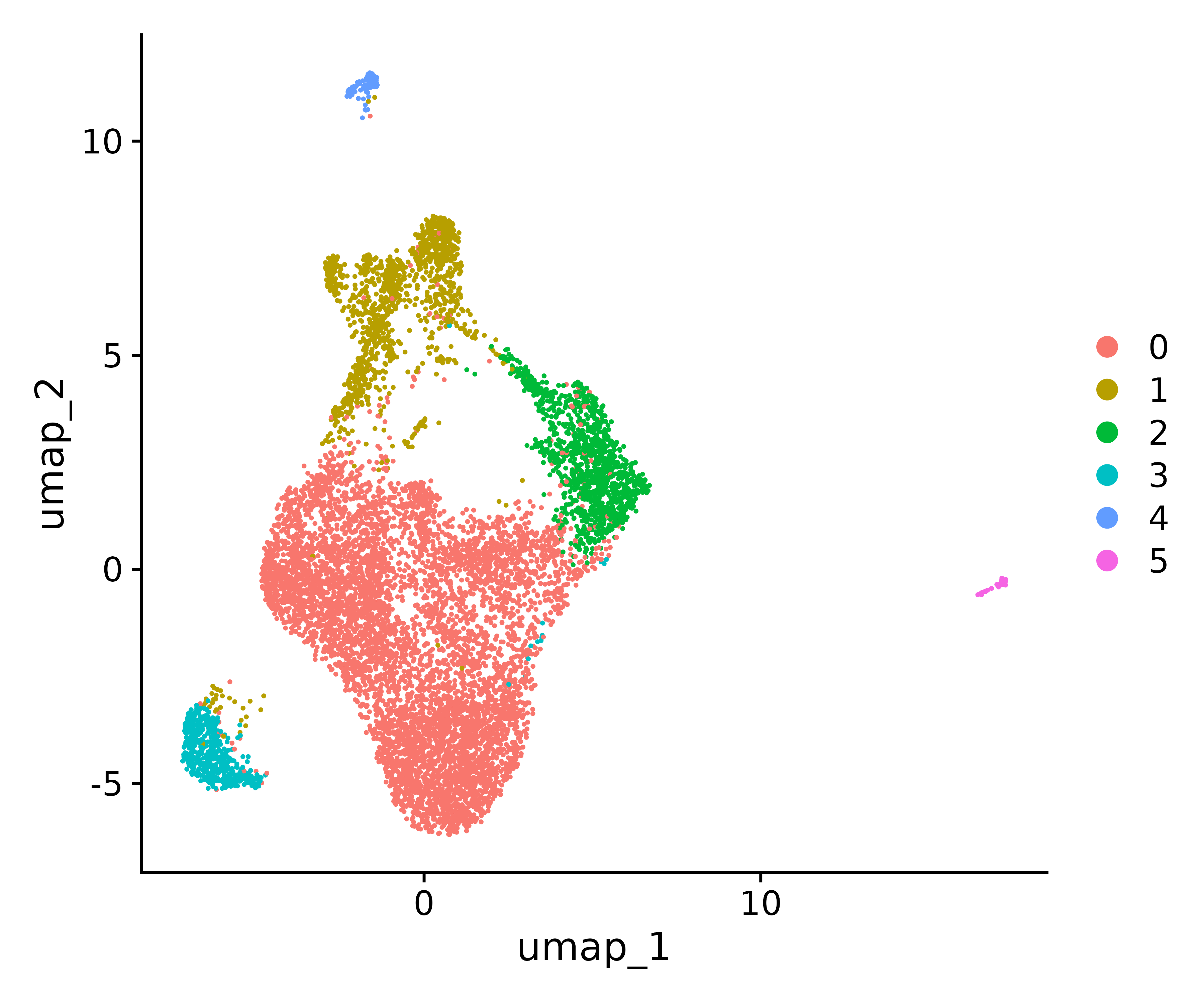
Visualization
There are three common plots for viewing gene expression in different clusters:
1. Heatmap 2. Bubble map 3.featureplot
table(Idents(seurat.final))
# find markers between cluster1 and cluster 2
##用来找 cluster 之间的寻找差异表达特征
cluster2.markers <- FindMarkers(seurat.final, ident.1 = 1,ident.2 = 2)
head(cluster2.markers, n = 5)
# find markers for every cluster compared to all remaining cells, report only the positive ones
#找每个 cluster 的 marker 基因
pbmc.markers <- FindAllMarkers(seurat.final, only.pos = TRUE)
ClusterMarker_noRibo <- pbmc.markers[!grepl("^RP[SL]", pbmc.markers$gene, ignore.case = F),]
ClusterMarker_noRibo_noMito <- ClusterMarker_noRibo[!grepl("^MT-", ClusterMarker_noRibo$gene, ignore.case = F),]
###去除核糖体基因和线粒体基因的影响
ClusterMarker_noRibo_noMito %>%
group_by(cluster) %>%
dplyr::filter(avg_log2FC > 1) %>%
slice_head(n = 5) %>%
ungroup() -> top5
###展示每个 cluster 的 top5 的基因
heatmap <- DoHeatmap(seurat.final, features = top5$gene) + NoLegend()
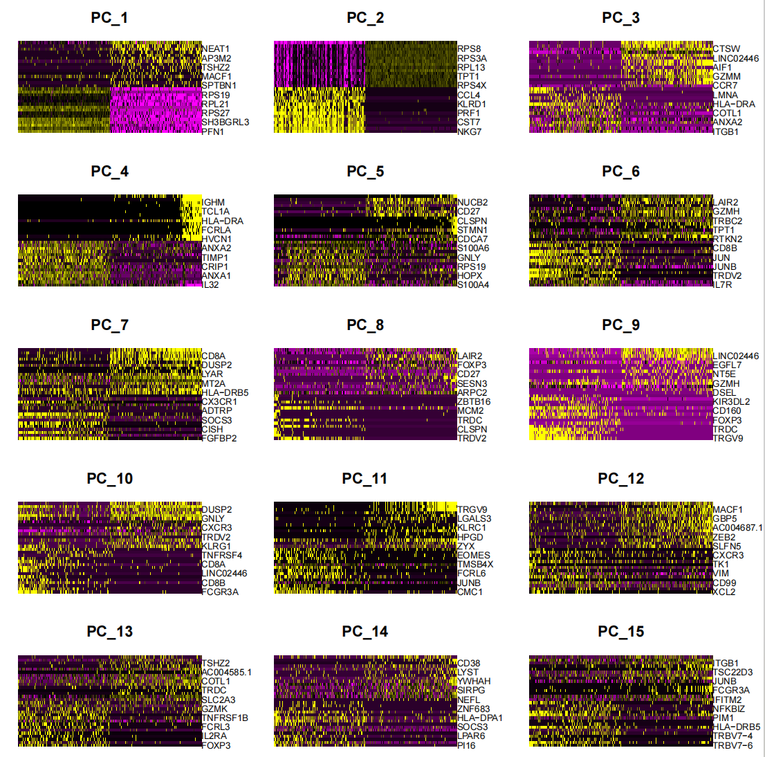
ggsave("heatmap.png", heatmap, width = 10, height =5 , dpi=600) This figure is a heat map showing marker genes
g =unique(top5$gene)
##定义 top5 的 gene 列,作为基因集 g,也可以自定义
p <- DotPlot(seurat.final,features=g)+
  coord_flip() +  # 翻转坐标轴
  theme(
    panel.grid = element_blank(),  # 移除网格线
    axis.text.x = element_text(angle = 0, hjust = 0.5, vjust = 0.5)  # 旋转 x 轴标签
  )
ggsave("allmarker_dotpot.png", p, width = 8, height =7 , dpi=600)
#气泡图展示 marker 基因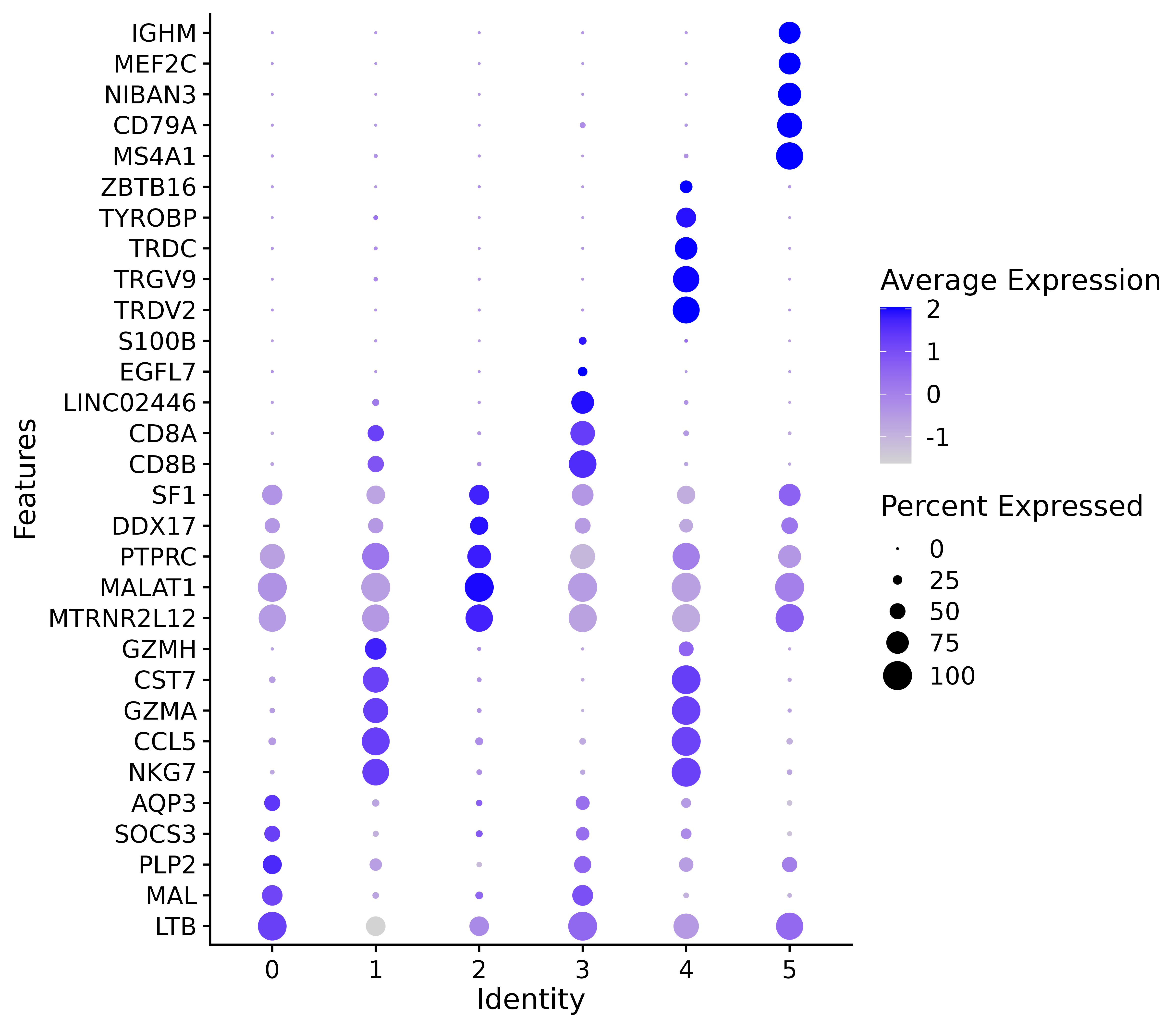
This figure is a bubble chart showing marker genes
# 加载 dplyr 包
library(dplyr)
# 提取 cluster 和 gene 列
cluster_gene_mapping <- top5 %>%
  select(cluster, gene)
# 查看结果
head(cluster_gene_mapping,30)
write.csv(cluster_gene_mapping,"cluster_allmarkers_TOP5.csv", row.names =
p <- FeaturePlot(seurat.final, features = g)
ggsave("allmarker_featurepot.png", p, width = 15, height =15 , dpi=600)
###查看自定义感兴趣的基因
p2 <- FeaturePlot(seurat.final, features = c("MS4A1", "GNLY", "CD3E", "CD14", "FCER1A", "FCGR3A", "LYZ", "PPBP",
"CD8A"))
ggsave("allmarker_featurepot2.png", p2, width = 15, height =15 , dpi=600)


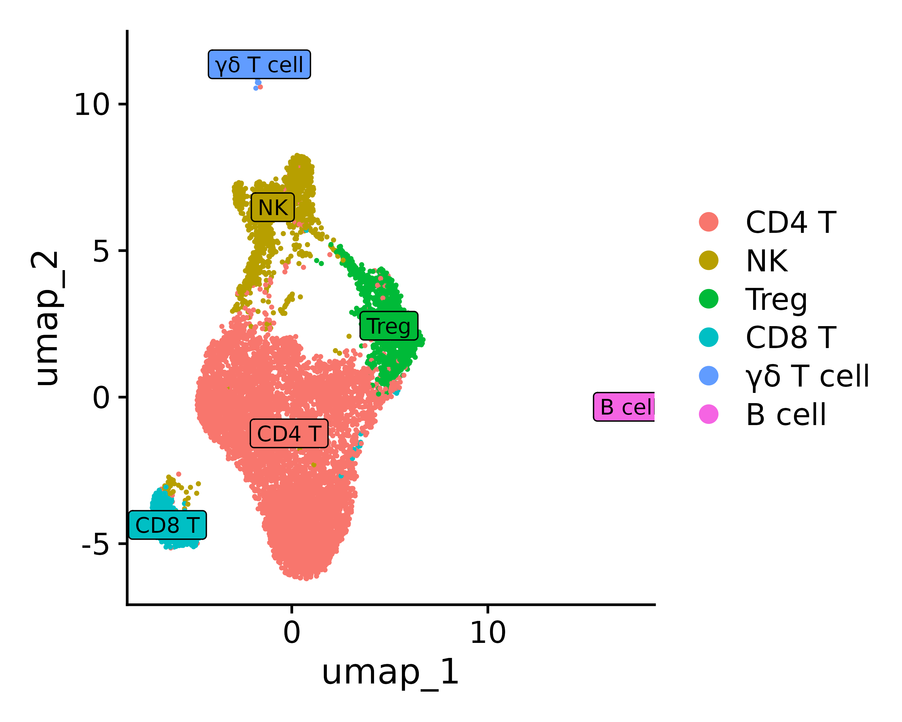
7. Data Analysis
This step describes how to use specific marker genes to determine and define cell types in single-cell transcriptome data analysis.
Assuming you have determined the cell type based on top marker genes etc., you can define the identity type
0 1 2 3 4 5 “CD4 T”, “NK”, “Treg”, “CD8 T”, “γδ T cell”, “B cell”
(The following comments are for reference only and are not actual comments.)
new.cluster.ids <- c("CD4 T", "NK", "Treg", "CD8 T", "γδ T cell",
                     "B cell")
names(new.cluster.ids) <- levels(seurat.final)
seurat.final <- RenameIdents(seurat.final, new.cluster.ids)
p <- DimPlot(seurat.final, reduction = "umap", label = TRUE, pt.size = 0.5) + NoLegend()

p3 = DimPlot(seurat.final, reduction = "umap", label = TRUE, label.size = 3, pt.size = .3, label.box = T)
ggsave("annotation_umap.png", p, width = 5, height =4 , dpi=600)
ggsave("annotation_umap2.png", p3, width = 5, height =4 , dpi=600)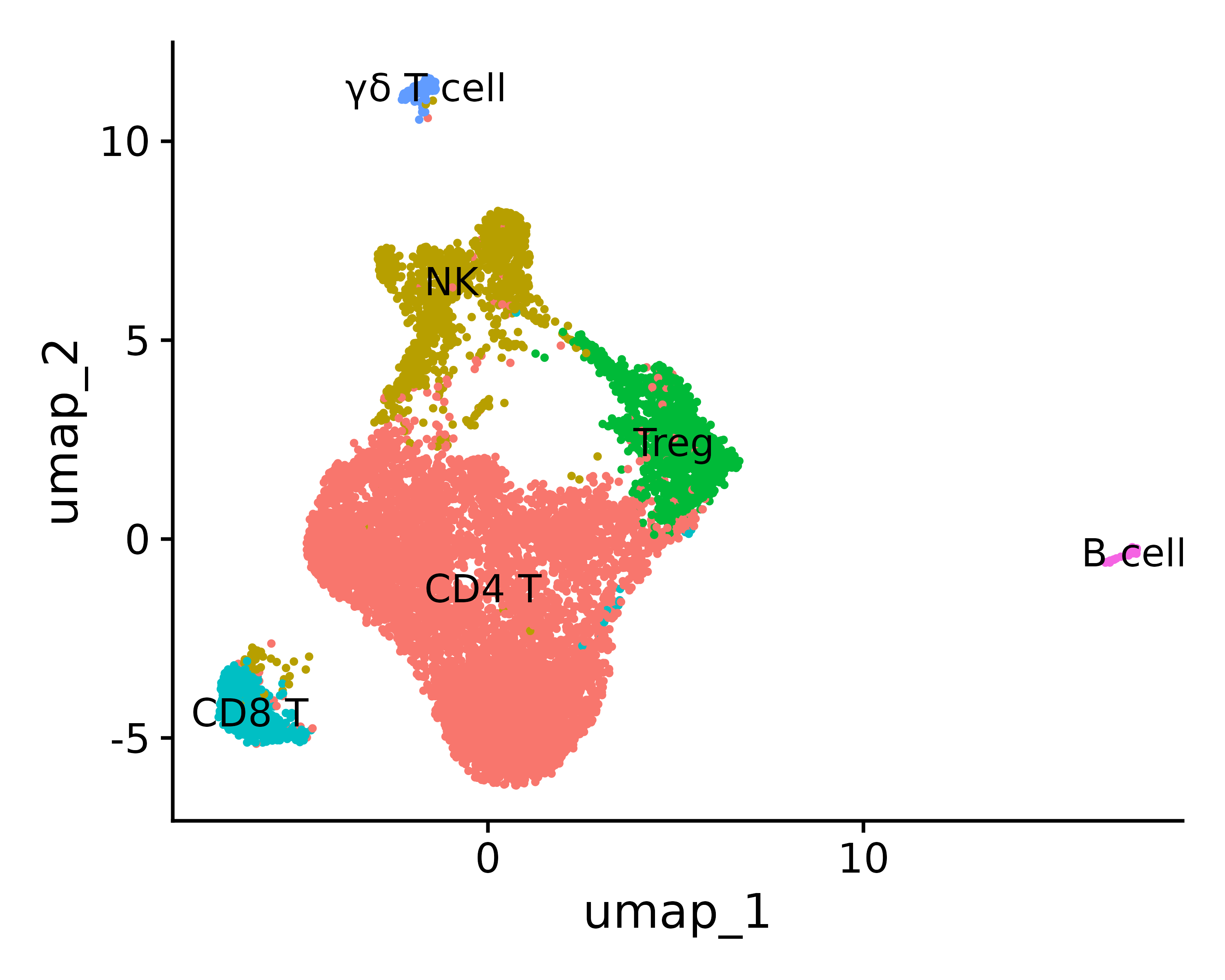
Reference
Build AI with AI
From idea to launch — accelerate your AI development with free AI co-coding, out-of-the-box environment and best price of GPUs.